
Central to the look of Ella Bella is the colour. In the scenes set in the “real” world, I wanted monochrome. Understandably, Orchard Books felt this wasn’t very commercial. But a muted palette was deemed acceptable and so I began to experiment. It took a while to work out the exact technique but in the end I decided on using three layers of art which would be printed on top of each other (one at a time). This gives a suitably vintage quality to the illustrations as it is exactly the way artists like Ardizzone had worked in the past. Fortunately my designer, Tim Rose, had worked on reissues of those books and had seen the orginal artwork, so gaining a good knowledge of how the technique worked.
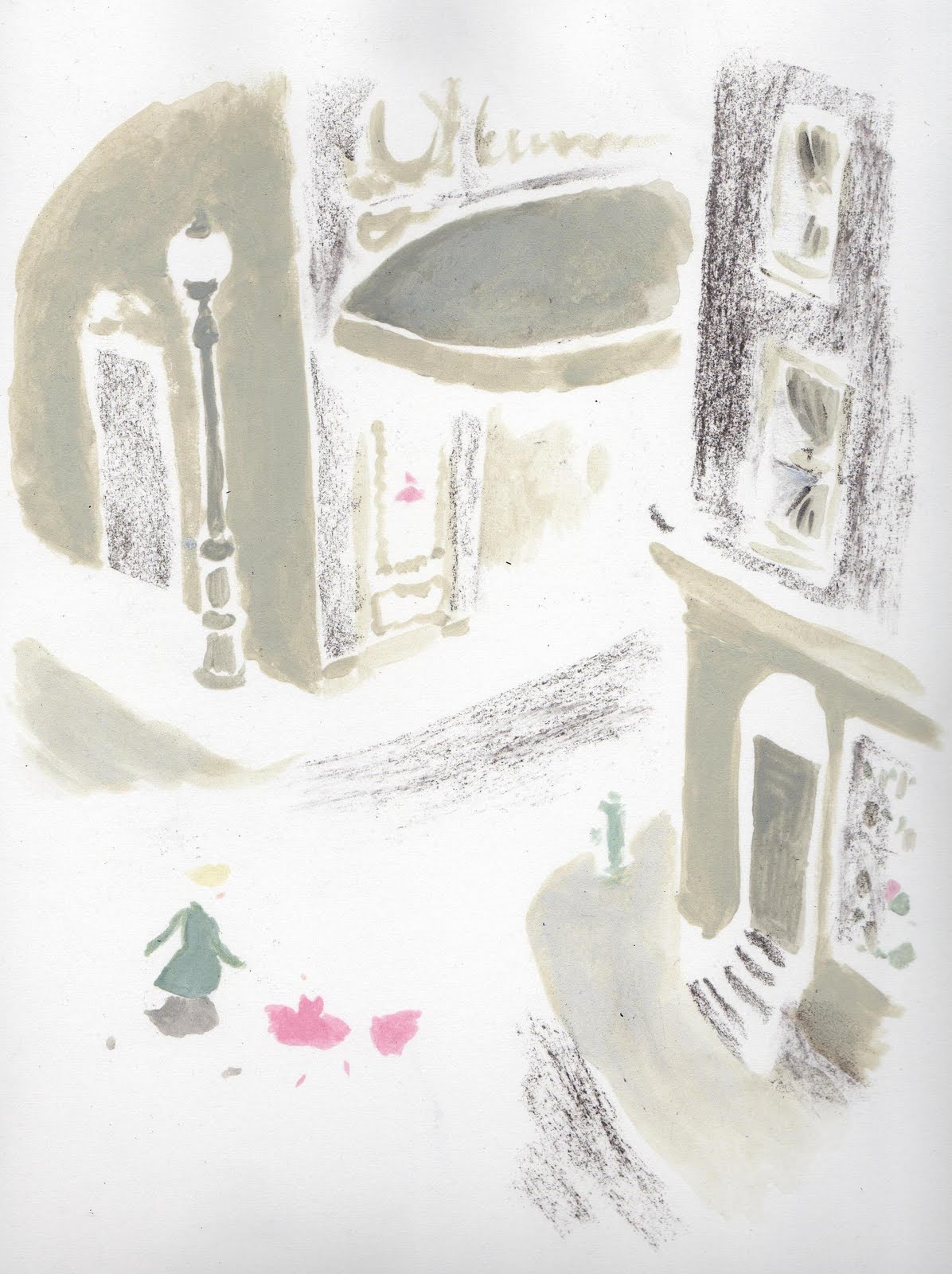
Using a light-box (actually an old window on table legs with an angle-poise underneath)I use a carefully constructed drawing as a guide and first produce a colour image. It looks kind of abstract at this stage…
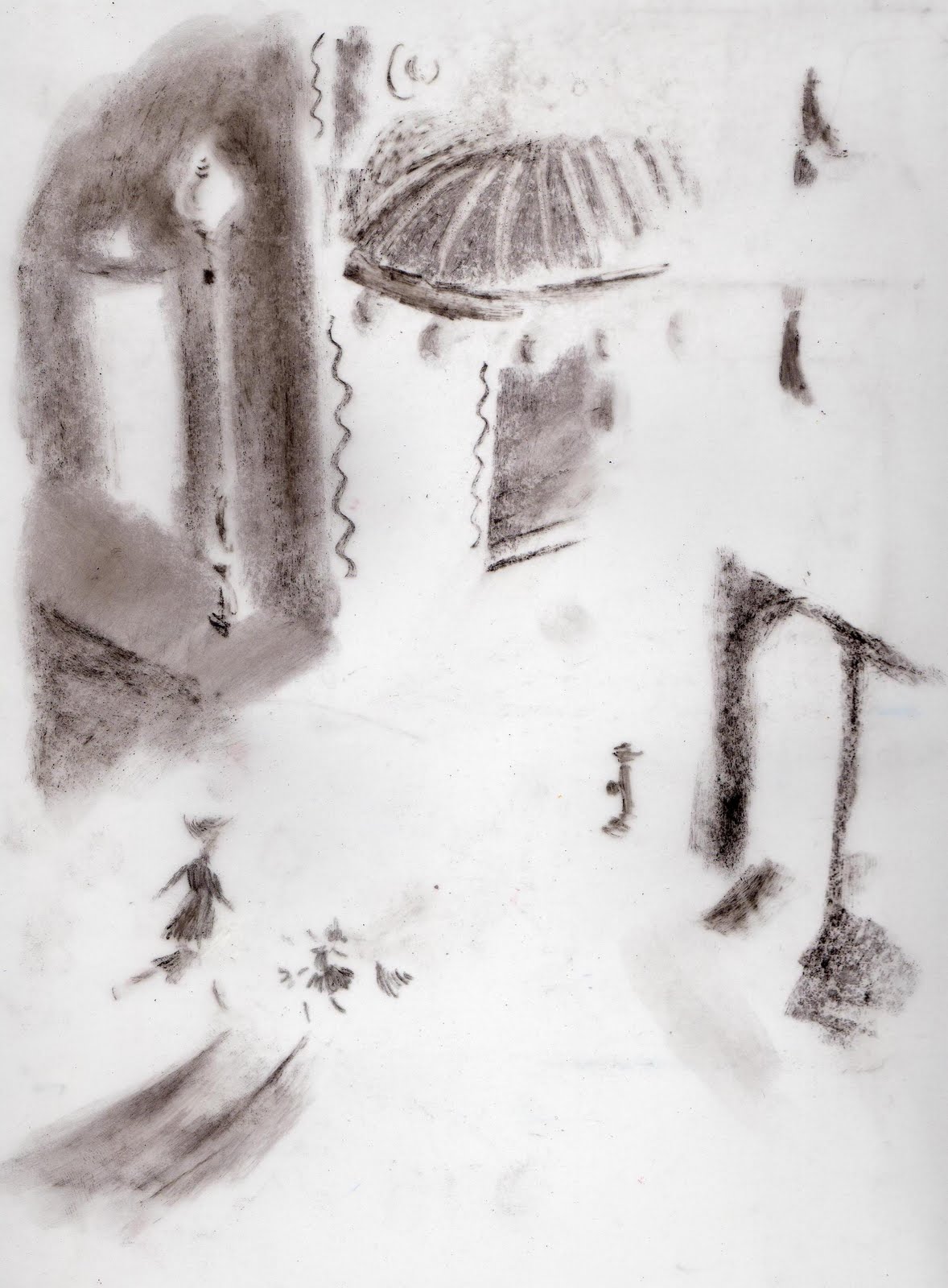
The next layer, which is a grey tone layer, is also hard to “read” in isolation, but gives a crutial flat tone which is so typical of books from the 40s and 50s. This is produced on someting called Polydraw, which is sort of glorified tracing paper…
Then, lastly, and also on Polydraw (which is semi-transparent), I do the line drawing that pulls everything together.
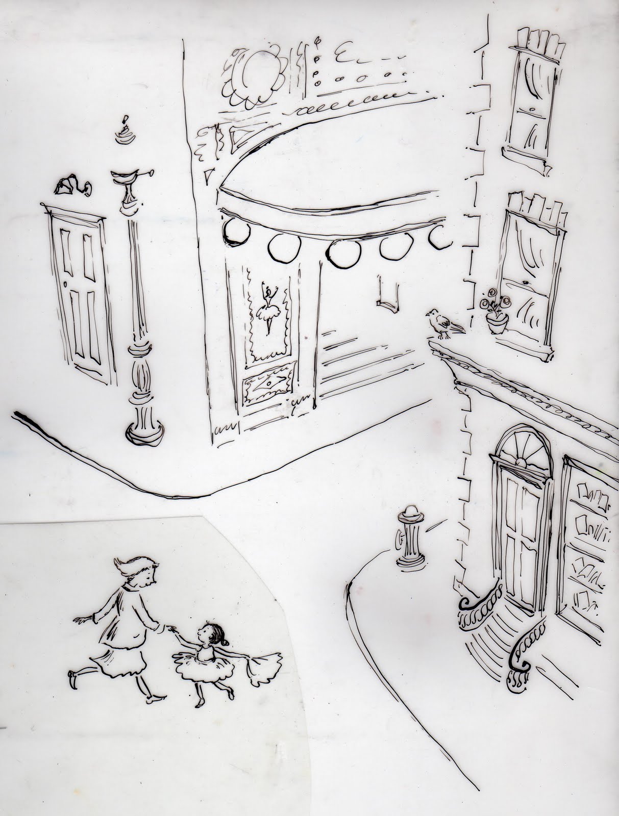
Until it is printed I can’t be sure of the effect I’m creating. I rather like that element of danger! The beauty of it is that, apart from the retro and classic feel it gives the pictures, it allows plenty of freedom with the drawing which can be redone many times if necessary without the need to redo the colour.
Finally, when assembled, the illustration looks like this:






Leave a Reply