
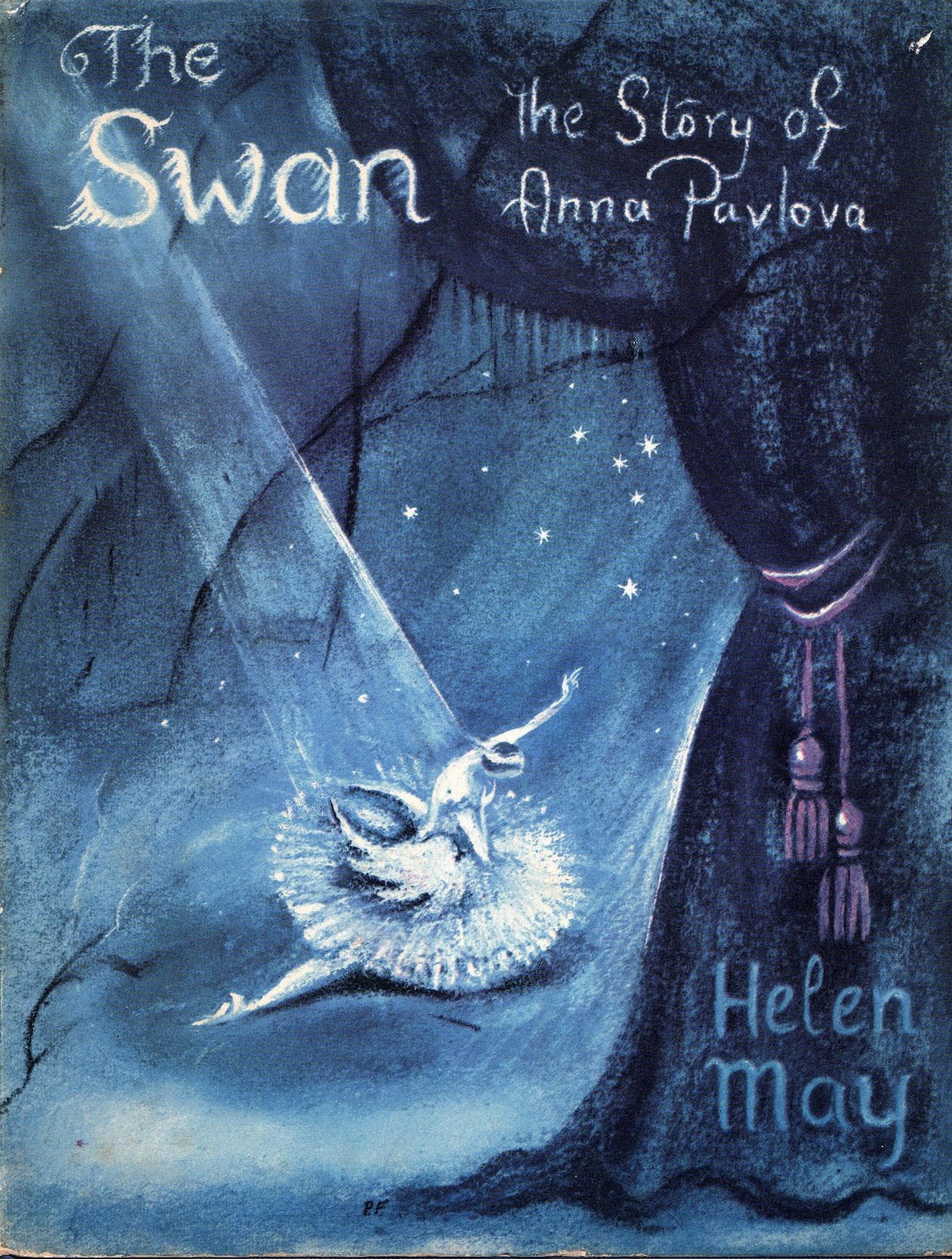
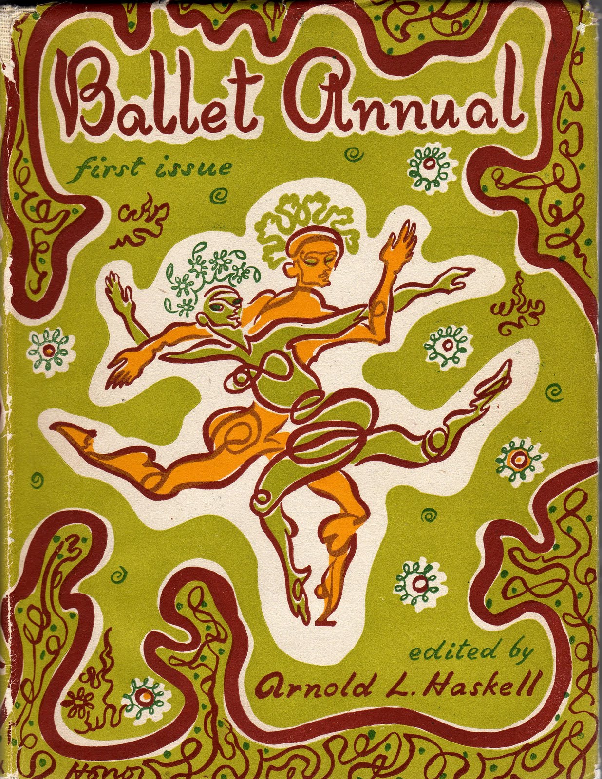
 More lovely pictures to inspire my version of Swan Lake. The text is almost complete and needs just a small tweak or two, according to my editor Liz. While I wait for the words to be set in the correct font by the designer Tim, I am surrounding myself with pictures to get my imagination racing.
I love the often jaunty colours, but of the three pictures I think the most interesting is the Ballet annual, in lime and tomato (?!), with no pink in sight at all. The fluid graceful lines redeem it I suppose! The Swan – a biography of Pavlova – is perhaps more appropriate for Swan Lake (although I can’t stop thinking of meringue now…). The fabric is full of strong lines and dramatic shapes.
You don’t see fabrics like that these days, not even with Cath Kidston or Rachel Riley. More’s the pity!





Leave a Reply